Bootstrap 5 Footer Design

In this blog, we will learn how to create a responsive footer using HTML, CSS, and the latest version of Bootstrap. Now, what is a website footer? The footer is an important element of a website that is usually found at the bottom of almost every web page. A website footer is where you add contact information, copyright statements, navigation buttons, and other things that are common to many websites.
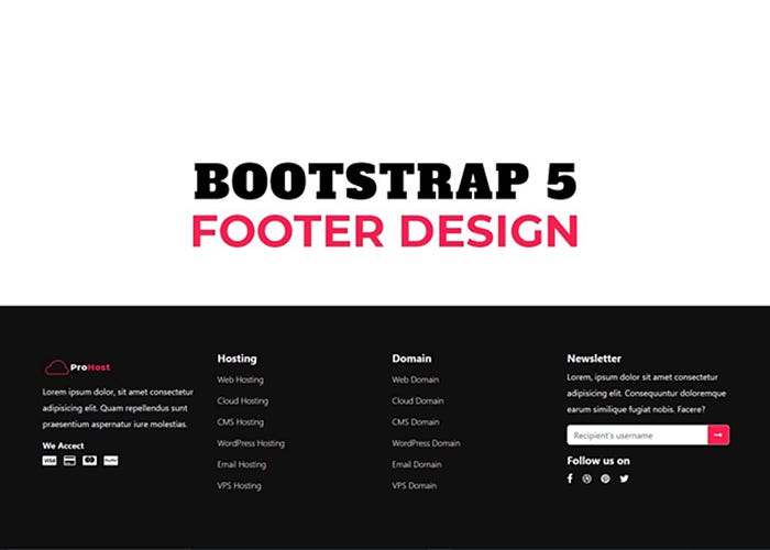
In this Project, we have made a responsive footer with four different columns. Each column contains separate information related to the website. In the First column, where we have included the logo of the website, some basic text, and some card icons. The card icons indicate the payment methods. In the second and third columns, we have included links that will take the user to their desired location when they click on them. In the fourth column, we included a signup form for visitors and some social media links to the website. DOWNLOAD CODE
